Tuesday, October 13, 2015

Still Life

The assignment given this week was to create two still-life photographs; one using all man-made objects, and one with predominantly natural objects.  A still life photograph is one in which a group of objects are set on a foreground, in front of a background and photographed, taking into consideration lighting and composition.  My professor gave positive feedback on both of my compositions overall; he said that the lighting was appropriate for both, and the composition of the objects within the photos are well placed. However, he said that both pieces are static, in that the objects are all fully within the frame of the picture, and the angle is pulled out far from the objects; if something were partially cropped out, it might lead the eye to wonder what is off camera.


Natural Object Still-Life

I posed the basket at an angle to make the objects more appealing, and placed a squash at the far end to add height to the photo.  I placed the napkin at the near end of the basket, and coming out of it to create leading lines to draw the eye down. I then added the gold pine cones to add visual balance, and placed one lamp at an angle on the basket to create shadow, and therefore more visual interest, and one lamp onto the background.  In the editing process, I made the background more smooth, and emphasized the shadows to echo the lines of the towel. 


Man-Made Objects Still Life

I arranged these objects on a shelf that had the sun streaming into it to create a "dark", almost masculine mood. I thought this paired well with the set of antique books and the all-wood background. However, now, as I look at it, I wish that I had opened or tuned the book at the front, showing the pages, or possibly let one of the books in the back fall at an angle to add more visual interest.

Portraiture

The assignment for this week is to create two portaits, each of them using a different lighting pattern. There are four different lighting patterns: the loop, the Rembrandt, the split, and the paramount. The split pattern divides the face in half in light and shadow.  The loop lighting pattern casts a small shadow of the subject's nose onto their cheek, The Rembrandt lighting pattern has a larger shadow from the subject's nose so that it blends in with the cheek shadow; it creates a triangle of light below the eye of the the shadowed side of the face. The paramount lighting pattern casts a shadow of the subject's nose over the lip.   There are two different lighting styles; short and broad.  The short lighting style shows the shadowed side of the face toward the camera, and the broad lighting style shows the lighted part of the face toward the camera.


Short Rembrandt
John asked me to take some acting headshots for him, and this is one of my favorites. The typical "Rembrandt style" light triangle is below his left eye.  The short lighting style was ideal, as it slims the face.

Model: John Reilly


Paramount

The Paramount lighting pattern, which is ideal for Nicole, as it minimizes blemishes and imperfections was originally used by The Paramount movie studio on their starlettes. That lighting also made a beautiful lighting on her hair, creating a halo of sorts.

Model: Nicole Marie Olson

Composition

For this photo, which emphasized composition, we were supposed to take a visually pleasing photograph of a place, and then take 4, also visually pleasing photographs within the area that we took the first photograph. All of the photos were taken in Lapham Peak State park at one small lake.

This is the photo which encompasses the scene. I chose the tree in the foreground and it's location because it makes a great natural framing on the left and top of the photo; the tree also catches the eye at the left, and draws the eye, using leading lines along the thin branch, so the eye can then look at the lake beyond.


This photo is a nice use of depth of field, keeping the foreground in focus, and putting the background out of focus, so that the emphasis stays on the beautiful red leaves and the texture on the trunk in the foreground.


This one is also a use of natural framing, with the tree trunks on either side of the picture; their leaning into the picture bring the eye further into the middle at the lake.


This picture was taken very close to the ground, again using a shallow depth of focus to emphasize the pretty leaves and berries. I used this angle specifically so the leaves could be shown against the lake to avoid an overly busy background.


This picture also includes ivy on a tree trunk, but I wanted to keep the whole picture in focus to show the lake as the focus, especially as there was a family across the lake, and the little girl's bright blue shirt balanced the rest of the picture nicely.

High Key, Low Key, Contrast, and Scale

This week, we were given the second half of the "Vocabulary of Photography" assignment. This week, we were to photograph a high key, a low key, a picture with high contrast, and a picture that emphasizes scale. As with every assignment, we must take into consideration composition, depth of field, creativity, and lighting, as well as highlighting the above vocabulary words.


High Key

A high key image is one that consists primarily of whites and light tones.  I took this image on a day where the sky was pretty much white, and  I thought it worked as a high key photo, as most of the photo was white.  However, my professor pointed out to me that a high key photo must have exclusively light tones, so the black sign doesn't work quite as well,  Looking back, I probably should have submitted it as the high contrast piece.


Low Key

A low key image is one that contains predominantly dark tones.  My first thought was to take a photograph of my husband's cat, Loki, as she has a soul as black as her fur. Of course, this made taking a photograph of her challenging, as she is not really cat that can be posed.  Luckily, she decided to take a rest on her cat tree, so I placed some lamps around her so I could include some of the details of her fur.  Unfortunately the cat tree is a cream color, so I burned those portions in the picture in photoshop both to avoid drawing the eye there, and to keep it a low key picture. My favorite part of this picture is the focus; Loki's green eyes, which look appropriately scheming.


Contrast 

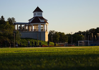
This picture was taken from across the football field of the newly built gazebo on the Carroll campus.  I took this particular photograph because I really liked how the light hit the gazebo at this time of the day. I felt that this angle was the best, as where the light hits the gazebo makes a great focal point. I took this picture very closely to the ground in front of the football field in order to get the grass in the front and to have it out of focus, which emphasizes the focal point even more. Taking the photo from this vantage point also makes the gazebo look a lot more real and powerful. I submitted this picture for the contrast assignment because of the great difference in tone from the very white of the gazebo to the dark colors in the shadows of the trees. 


Scale

To emphasize scale, which is comparing the size of one object to another, I used some small pinecones I found, each a different shade, and placed them in my husband's hand to show their size. I also did this at a time of the day that emphasized the shadows, and make the pinecone's sizes exaggerated. Looking at this photo now, I think that having his hands farther from the grass and to possibly blur it to emphasize the hands and pinecones. 


Color, Texture, and Depth of Field

This is the first half of our "Vocabulary of Photography" assignment. For this week, we took photos focusing on color, texture, and depth of field. Like the last assignment, we should take into consideration composition, creativity, lighting, and what story the photograph tells; we should take these into consideration in addition to the focus on each vocabulary terms, and what they mean in photography. The color and texture pictures were taken with a cell phone camera, as we had not received our "Rebel" cameras yet, but the depth of field pictures were taken with the "Rebel".


Color

For this photograph, I wanted to capture the color of the leaves and the different hues they take on when they are layered and the light shows through them; from a dark, forest green, to a very light spring green.  The play of the light and shadow also highlight the shape of each leaf and where they are layered, creating a calming mood.  Some criticism from my professor, Bill Zuback, was that maybe I would want to rotate the image 180 degrees so that the lighter portion of the photograph is toward the sky, as that gives a feeling of being uplifted.


Texture

The important part about this photograph is to emphasize not only that an object possesses texture, but that texture is demonstrated by how the lighting hits the object, highlighting the depth of the texture, creating a third dimension to a normally 2 dimensional medium. I liked how the the lighting that was used on this building on the Carroll campus highlighted the the interesting texture the building had within its bricks and above and below the windows. Photographing a building can be tough, as you are trying to make a work of art of an already existing work of art, but the feedback from Bill was that I had done well on that aspect as well as capturing the texture the building has.


Extended Depth of Field


Shallow Depth of Field

These are two photographs I took of some rose bushes near the athletic fields on the Carroll campus. The first has and extended depth of field, which means that everything in the picture is in focus.  The second picture is of the same rose bush, but I focused only on one rose, leaving the rest of the picture out of focus. The shallow depth of field is a great tool in photography which one can use to highlight something in a picture to emphasize the focal point.

Person, Place and Thing

The objective of this assignment was to take a picture of a person, a place, and a thing in the most attentive way possible. We were supposed to pay attention to creativity, composition, angle, and lighting while taking the photographs. At this point of the class, we had not yet received our cameras, so these were taken with a cell phone camera. I took all three of these photos at the "Kites over Lake Michigan" festival in Two Rivers, Wisconsin. 


Person


The "person" picture is of my husband. I had him stand on that particular background because I like the monochromatic aspect with his gray shirt, blue/gray jacket and the gray of the rainy lake, as it was obviously an overcast day. I kept quite a bit of white space, because I generally like that aesthetic, and it increases the calming nature of the photograph.

Model: Chris L.


Place

I picked the "place" in this particular location because I liked the ambiance of the fog, the mood it created with the house, and the line of the waterway that draws the eye from the house. 


Thing

The thing, or "things" are japanese lanterns that were released en mass at the festival later in the day.  Unfortunately, the fog obstructed the view, making the photo not quite as impressive as it could have been (with many lanterns in view, if there weren't fog), but I think turned out beautiful, nonetheless, as the fog, once again, added some interest itself.  I considered cutting out the trees at the bottom, but decided to keep it in, as it added orientation to a picture that might have been confusing otherwise.