Wednesday, December 9, 2015

Metaphors and Harmony

This week we had two types of assignment; one was assigned by a game we did in class called 'The Conversation Game; My assignment was to take a picture of "harmony, but in nature". The second assignment was to take four pictures that represent four metaphors; a metaphor is defined as one thing that is used to refer to another thing in order to show or suggest that they are similar.


Harmony, not in nature.

This is a photo of the rehearsal of a Christmas cabaret that is being put on at Theatre on Main in Oconomowoc.  What better represents harmony both metaphorically (in multiple people working together on a show), and literally (They are singing). This is stage lighting that they were using for the rehearsal, and they were told I was coming, so they did dress up a bit more than they would have otherwise, as these pictures were also used for marketing for the show.

Models: Matt Zembrowski, Lori Nappe, Michael Skocir


"Bowing to the Sun God"
Metaphor

I had this idea in my head, which obviously wouldn't have worked with the trees bare as they are now, so I went back into some pictures I took previously for this class, but not used, and edited and cropped this to represent what I imagined. I like this image and meaning in multiple aspects; first, I think it physically looks like the trees are bowing to the sun, with the leaves representing hair. Second, trees and plants are known to physically move or grow toward a light source, because, of course, the light is life giving to a tree. Lastly, it is reminiscent of some of the earliest human religions; many of which worshiped the sun.    


"Monkey Business"
Metaphor

I think the meaning of this one is pretty obvious, but it did take a while to set up; there were quite a few safety pins holding monkey hands in correct places and attaching objects to them.  However, I kept the pedestals I used to hold up the monkeys in the frame to represent the monkeys being sort of puppets, of course, referring to the business world.  I placed the scene next to a window late in the afternoon so the light would shine directly on the monkeys.


"Internet Dating"
Metaphor

This photo was taken at People's Park Restaurant in Downtown Waukesha, and the only props used were the masks, and anything we still had on the table after having drinks. The lighting was conveniently red-tinted by the Christmas lights on the ceiling.  

Models: Nicole Marie Olson and John Reilly


"The Dangers of Caffeine"
Metaphor

This was taken near a window in the late afternoon for lighting, but about 4 feet away from the window for more indirect lighting, as the ones I took directly in the window all overexposed the t-rex, and reduced the visible details. 

Thursday, December 3, 2015

Motion, Pan and Silhouette

The assignment this week was to take one pan shot, one photo with a motion blur, and one silhouette. The pan shot is a picture of something that is moving, and the object is mostly in focus (with the exception of any moving parts), while the background is a blur, showing the direction of the movement. The motion blur photo should show movement in some way; not just out of focus.The Silhouette shows objects 2 stops darker or more in the foreground, with a lighter background; typically the objects in the foreground have little to no details.


Motion

This was taken of some dancers at the Milwaukee Folk Fair International. I love the way the motion changes the patterns on the the dancers skirts, I was able to study these patterns, as the original pictures had a person's head in front of the bottom of the skirts, and I used the clone stamp to remove it. It taught me that performance photography can be challenging; every shot I took had people in front of the shot, the lighting was funny, or distracting objects in the back; photoshop helps quite a bit to remove minor distractions that you can't control otherwise. 


Pan

I also found the pan shot highly challenging; I tried taking picture of cars and trains, and most of them were too fast to get them in focus. So, I attached me camera to a tripod, and had my husband  run back and forth with treats in his hand for the cat; this was pretty much the only thing that made her run fast enough to get a pan shot of her. I turned the lights on in the room behind the cat, which added some nice lighting to her fur, and created some interesting shadows in front of her.


Silhouette

For this shot, which was taken on the edge of lake pewaukee, I adjusted the shutter speed and aperture according to the light meter while pointing the camera only at the sky.  I composed the picture I wanted with the trees and picnic table in the foreground, and then took the picture with the shutter speed and aperture unchanged.

Photo Story

The assignment this week was to tell a story with our photographs, including beginning, middle and end, in three to five photographs.  My story, of a woman who get stood up at a coffee shop is pretty simple, but still it would have been much easier with more photos to work with; it required putting a lot into each image. The first image sets up the story, with the coffee sign, and the emotion in her face already shows doubt; the motion of her face looking behind. The second picture shows her looking up from her phone, her cup in the photo. The third, out of focus except for the greenery above shows her at a large table by herself, while others by themselves sit at much smaller tables. The fourth photo just shows the cup that was already established as her is crushed and left on the tables.  The final shot shows her walking away in the rain with the same umbrella from the first shot.

The day this was shot was very gray, and it down-poured for most of the day, so many of these photos were tough to get, as the indoor shots were quite dark, and we had to wait until the rain was at least light enough to see the model. I think despite these setbacks, they turned out really well; the first and last being very strong. Although, one of my favorites is the fourth shot, which I feel is pretty much the turning point of the story, and shows a lot of strength; I also like the details of the tables and the reflection of the window that almost makes the table look like water itself.


Model: Erin Hartman

Beauty

This week's assignment was to photograph beauty; whatever that meant to us.  One of the two photos had to be of a person or animal, and one had to be of an inanimate object.


Beauty: living thing

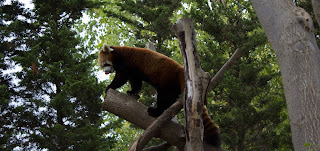
This is a red panda at the Milwaukee County Zoo.  My first bachelors degree was in zoology, so I have a strong love for animals, and I find this one particularly beautiful. The red panda is not out of it's enclosure very often, as it is quite temperature sensitive, and when it climbs this particular tree, there is no glass impeding the view, which made it ideal for photographing a zoo animal.  My favorite part about this particular photograph is that if one looks very close, you will see that the panda is licking it's nose. I used this particular cropping because the tree on the right makes a nice natural framing of the photograph, and the long shape mimics the panda's body as well.


Beauty: Inanimate object

These grasses, located on the Carroll University campus, against the gradient blue sky, represent my idea; the interplay of humans with nature in its element. 

Vocabulary II Assignment

This assignment asked us to take a fresh look on a subject we photographed at the beginning of the class, and looking back, I do think I like these better than the originals.  We were asked to take new photos emphasizing the "Vocabulary of Photography"; color, contrast, line, scale, shape, and texture.

Color

When I saw this building in Walker's point, I couldn't help but use it as my example for color; the contrast of the yellow and orange building looked like such a riot of colors compared to the drab beige buildings all around it.


Contrast

When I took this picture on the Carroll University campus, even in color, it was mostly black, white, and a mix of greys.  However, turning it to a black and white photograph accentuated the contrast even more, as the small amount of green leaves previously shown in the background was a bit distracting.


Line

The line created by this waterfall in Lake Park was so intriguing, and I thought this particular angle emphasized that aspect.  The whole thing becomes a leading line; first drawing your eye to the top, as the water is the lightest there, and brings your eyes, weaving all the way down to the bottom. 


Scale

This is close up of the "Unity Volcano" my Maid of Honor made for my wedding ceremony; she added some dinosaurs on the volcano, as dinosaurs was part of our theme as well. I though that the "bridezilla", as it were, made a wonderful picture showing scale, as the dinosaur is tiny, but close up, could be mistaken for the real size.  The dinosaur being shown against a volcano of proportionate size doesn't hurt either.  I bumped up the colors a little bit in this picture, and added a vignette, evoking monster films of the past, as, of course, they were mostly filmed in small scale as well, 


Shape

The shape of the lion sculpture in lake park against the fall sky stuck me as an emphasis in shape, as the shape of the lion is silhouetted, the background is far behind the subject, and is such a different color.


Texture

I waited to take this photo of a statue on the Carroll campus until the sun was right on the horizon, setting, so the shadows would show up the most, highlighting the texture on the face; especially on the hair and smile lines.

Professional Inspiration

This week, were were not to take photographs ourselves, but choose photographs or print ads that inspire us professionally, and why. These pieces should be what inspires and drives us as creative professionals, and we explained in class why these inspire use.


Annie Leibovitz for Disney Parks

As a marketing professional who has worked at Disney parks, I have admired this specific campaign for a while as one of my favorites. Disney as a company produces wonderfully beautiful campaigns consistently, and I think this one tops most of them.  I may be of this opinion because these photographs were taken by Annie Leibovitz, who is also one of my favorite photographers.  They are combinations of portraits and landscapes (I am guessing the photo of the subject was taken separately of the landscape), but then made hyper-realistic by adding familiar, household Disney characters (the fantastical aspect increased by the fact that they are played by celebrities) and computer generated fantasy elements. The melding of media is impressive; it's grandiosity is juxtaposed  by the addition of small familiar font in the whitespace, reminding you of where these dreams come true. Just speaking of the photography, no detail was overlooked; the lighting is consistent and dramatic, theoretically taken in the "golden hour", most of the light peaking over the mountain to the right.  The fire, which I'm guessing was computer generated, also contributes to the lighting on the horse. Lastly, a vignette was added to the whole picture to add to the dramatic "fairy tale" look.


Mockingjay (The Hunger Game Series)

I picked this one, in part, because it was the exact opposite of the photograph above, as it is extremely understated overall.  I also picked it because it is almost subversive in nature. If you are not familiar with the Hunger Games series, you have to look very hard to know what is being advertised.  Being based on historical propaganda, they picked an appropriate, almost USSR inspired font. The red, nicely repeated in the apple and the District 12 sign, is a color used by many communist states. This type of advertisement, while it can be a gamble, depending on if people understand what it is being advertised or not, can pay off greatly, as it invites more thought, and therefore, is more likely to be shared through social media. 


A photograph inspired by your favorite artist

This week we were asked to compose a photograph that is inspired by another artist.  After all, imitation is the greatest form of flattery. I chose to imitate the style of Vermeer; specifically "The Woman with a Lute", which is shown below.  I did not want to copy it exactly, but imitate the lighting, colors, and general arrangement of objects. I asked the model to dress in similar colors (yellows or creams), put her hair up, wear long earrings, and bring a stringed instrument (the one shown is a mandolin).  Unfortunately, I didn't have a window with the sun shining in on the same side as the painting, so I set it up with similar objects in a mirror image in a window to the model's right, and then flipped the picture in post-production. I chose to take this picture a few hours before sun-down so that the sun would come deeply into the window, and create the bright light on the subject's face, like in the painting, and would create the deep shadows in other parts of the room, making the furniture in the foreground a silhouette. The original photo was longer from left to right, as the window in the house was farther to the right, but to reduce white space, I moved the window closer to the model, and made the resulting picture more narrow, like the original painting.


Model: Erin Hartman
Props: Mandolin, mini-piano, piano seat, various pieces of luggage


Tuesday, October 13, 2015

Still Life

The assignment given this week was to create two still-life photographs; one using all man-made objects, and one with predominantly natural objects.  A still life photograph is one in which a group of objects are set on a foreground, in front of a background and photographed, taking into consideration lighting and composition.  My professor gave positive feedback on both of my compositions overall; he said that the lighting was appropriate for both, and the composition of the objects within the photos are well placed. However, he said that both pieces are static, in that the objects are all fully within the frame of the picture, and the angle is pulled out far from the objects; if something were partially cropped out, it might lead the eye to wonder what is off camera.


Natural Object Still-Life

I posed the basket at an angle to make the objects more appealing, and placed a squash at the far end to add height to the photo.  I placed the napkin at the near end of the basket, and coming out of it to create leading lines to draw the eye down. I then added the gold pine cones to add visual balance, and placed one lamp at an angle on the basket to create shadow, and therefore more visual interest, and one lamp onto the background.  In the editing process, I made the background more smooth, and emphasized the shadows to echo the lines of the towel. 


Man-Made Objects Still Life

I arranged these objects on a shelf that had the sun streaming into it to create a "dark", almost masculine mood. I thought this paired well with the set of antique books and the all-wood background. However, now, as I look at it, I wish that I had opened or tuned the book at the front, showing the pages, or possibly let one of the books in the back fall at an angle to add more visual interest.

Portraiture

The assignment for this week is to create two portaits, each of them using a different lighting pattern. There are four different lighting patterns: the loop, the Rembrandt, the split, and the paramount. The split pattern divides the face in half in light and shadow.  The loop lighting pattern casts a small shadow of the subject's nose onto their cheek, The Rembrandt lighting pattern has a larger shadow from the subject's nose so that it blends in with the cheek shadow; it creates a triangle of light below the eye of the the shadowed side of the face. The paramount lighting pattern casts a shadow of the subject's nose over the lip.   There are two different lighting styles; short and broad.  The short lighting style shows the shadowed side of the face toward the camera, and the broad lighting style shows the lighted part of the face toward the camera.


Short Rembrandt
John asked me to take some acting headshots for him, and this is one of my favorites. The typical "Rembrandt style" light triangle is below his left eye.  The short lighting style was ideal, as it slims the face.

Model: John Reilly


Paramount

The Paramount lighting pattern, which is ideal for Nicole, as it minimizes blemishes and imperfections was originally used by The Paramount movie studio on their starlettes. That lighting also made a beautiful lighting on her hair, creating a halo of sorts.

Model: Nicole Marie Olson

Composition

For this photo, which emphasized composition, we were supposed to take a visually pleasing photograph of a place, and then take 4, also visually pleasing photographs within the area that we took the first photograph. All of the photos were taken in Lapham Peak State park at one small lake.

This is the photo which encompasses the scene. I chose the tree in the foreground and it's location because it makes a great natural framing on the left and top of the photo; the tree also catches the eye at the left, and draws the eye, using leading lines along the thin branch, so the eye can then look at the lake beyond.


This photo is a nice use of depth of field, keeping the foreground in focus, and putting the background out of focus, so that the emphasis stays on the beautiful red leaves and the texture on the trunk in the foreground.


This one is also a use of natural framing, with the tree trunks on either side of the picture; their leaning into the picture bring the eye further into the middle at the lake.


This picture was taken very close to the ground, again using a shallow depth of focus to emphasize the pretty leaves and berries. I used this angle specifically so the leaves could be shown against the lake to avoid an overly busy background.


This picture also includes ivy on a tree trunk, but I wanted to keep the whole picture in focus to show the lake as the focus, especially as there was a family across the lake, and the little girl's bright blue shirt balanced the rest of the picture nicely.

High Key, Low Key, Contrast, and Scale

This week, we were given the second half of the "Vocabulary of Photography" assignment. This week, we were to photograph a high key, a low key, a picture with high contrast, and a picture that emphasizes scale. As with every assignment, we must take into consideration composition, depth of field, creativity, and lighting, as well as highlighting the above vocabulary words.


High Key

A high key image is one that consists primarily of whites and light tones.  I took this image on a day where the sky was pretty much white, and  I thought it worked as a high key photo, as most of the photo was white.  However, my professor pointed out to me that a high key photo must have exclusively light tones, so the black sign doesn't work quite as well,  Looking back, I probably should have submitted it as the high contrast piece.


Low Key

A low key image is one that contains predominantly dark tones.  My first thought was to take a photograph of my husband's cat, Loki, as she has a soul as black as her fur. Of course, this made taking a photograph of her challenging, as she is not really cat that can be posed.  Luckily, she decided to take a rest on her cat tree, so I placed some lamps around her so I could include some of the details of her fur.  Unfortunately the cat tree is a cream color, so I burned those portions in the picture in photoshop both to avoid drawing the eye there, and to keep it a low key picture. My favorite part of this picture is the focus; Loki's green eyes, which look appropriately scheming.


Contrast 

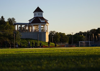
This picture was taken from across the football field of the newly built gazebo on the Carroll campus.  I took this particular photograph because I really liked how the light hit the gazebo at this time of the day. I felt that this angle was the best, as where the light hits the gazebo makes a great focal point. I took this picture very closely to the ground in front of the football field in order to get the grass in the front and to have it out of focus, which emphasizes the focal point even more. Taking the photo from this vantage point also makes the gazebo look a lot more real and powerful. I submitted this picture for the contrast assignment because of the great difference in tone from the very white of the gazebo to the dark colors in the shadows of the trees. 


Scale

To emphasize scale, which is comparing the size of one object to another, I used some small pinecones I found, each a different shade, and placed them in my husband's hand to show their size. I also did this at a time of the day that emphasized the shadows, and make the pinecone's sizes exaggerated. Looking at this photo now, I think that having his hands farther from the grass and to possibly blur it to emphasize the hands and pinecones. 


Color, Texture, and Depth of Field

This is the first half of our "Vocabulary of Photography" assignment. For this week, we took photos focusing on color, texture, and depth of field. Like the last assignment, we should take into consideration composition, creativity, lighting, and what story the photograph tells; we should take these into consideration in addition to the focus on each vocabulary terms, and what they mean in photography. The color and texture pictures were taken with a cell phone camera, as we had not received our "Rebel" cameras yet, but the depth of field pictures were taken with the "Rebel".


Color

For this photograph, I wanted to capture the color of the leaves and the different hues they take on when they are layered and the light shows through them; from a dark, forest green, to a very light spring green.  The play of the light and shadow also highlight the shape of each leaf and where they are layered, creating a calming mood.  Some criticism from my professor, Bill Zuback, was that maybe I would want to rotate the image 180 degrees so that the lighter portion of the photograph is toward the sky, as that gives a feeling of being uplifted.


Texture

The important part about this photograph is to emphasize not only that an object possesses texture, but that texture is demonstrated by how the lighting hits the object, highlighting the depth of the texture, creating a third dimension to a normally 2 dimensional medium. I liked how the the lighting that was used on this building on the Carroll campus highlighted the the interesting texture the building had within its bricks and above and below the windows. Photographing a building can be tough, as you are trying to make a work of art of an already existing work of art, but the feedback from Bill was that I had done well on that aspect as well as capturing the texture the building has.


Extended Depth of Field


Shallow Depth of Field

These are two photographs I took of some rose bushes near the athletic fields on the Carroll campus. The first has and extended depth of field, which means that everything in the picture is in focus.  The second picture is of the same rose bush, but I focused only on one rose, leaving the rest of the picture out of focus. The shallow depth of field is a great tool in photography which one can use to highlight something in a picture to emphasize the focal point.

Person, Place and Thing

The objective of this assignment was to take a picture of a person, a place, and a thing in the most attentive way possible. We were supposed to pay attention to creativity, composition, angle, and lighting while taking the photographs. At this point of the class, we had not yet received our cameras, so these were taken with a cell phone camera. I took all three of these photos at the "Kites over Lake Michigan" festival in Two Rivers, Wisconsin. 


Person


The "person" picture is of my husband. I had him stand on that particular background because I like the monochromatic aspect with his gray shirt, blue/gray jacket and the gray of the rainy lake, as it was obviously an overcast day. I kept quite a bit of white space, because I generally like that aesthetic, and it increases the calming nature of the photograph.

Model: Chris L.


Place

I picked the "place" in this particular location because I liked the ambiance of the fog, the mood it created with the house, and the line of the waterway that draws the eye from the house. 


Thing

The thing, or "things" are japanese lanterns that were released en mass at the festival later in the day.  Unfortunately, the fog obstructed the view, making the photo not quite as impressive as it could have been (with many lanterns in view, if there weren't fog), but I think turned out beautiful, nonetheless, as the fog, once again, added some interest itself.  I considered cutting out the trees at the bottom, but decided to keep it in, as it added orientation to a picture that might have been confusing otherwise.